LINKSYS
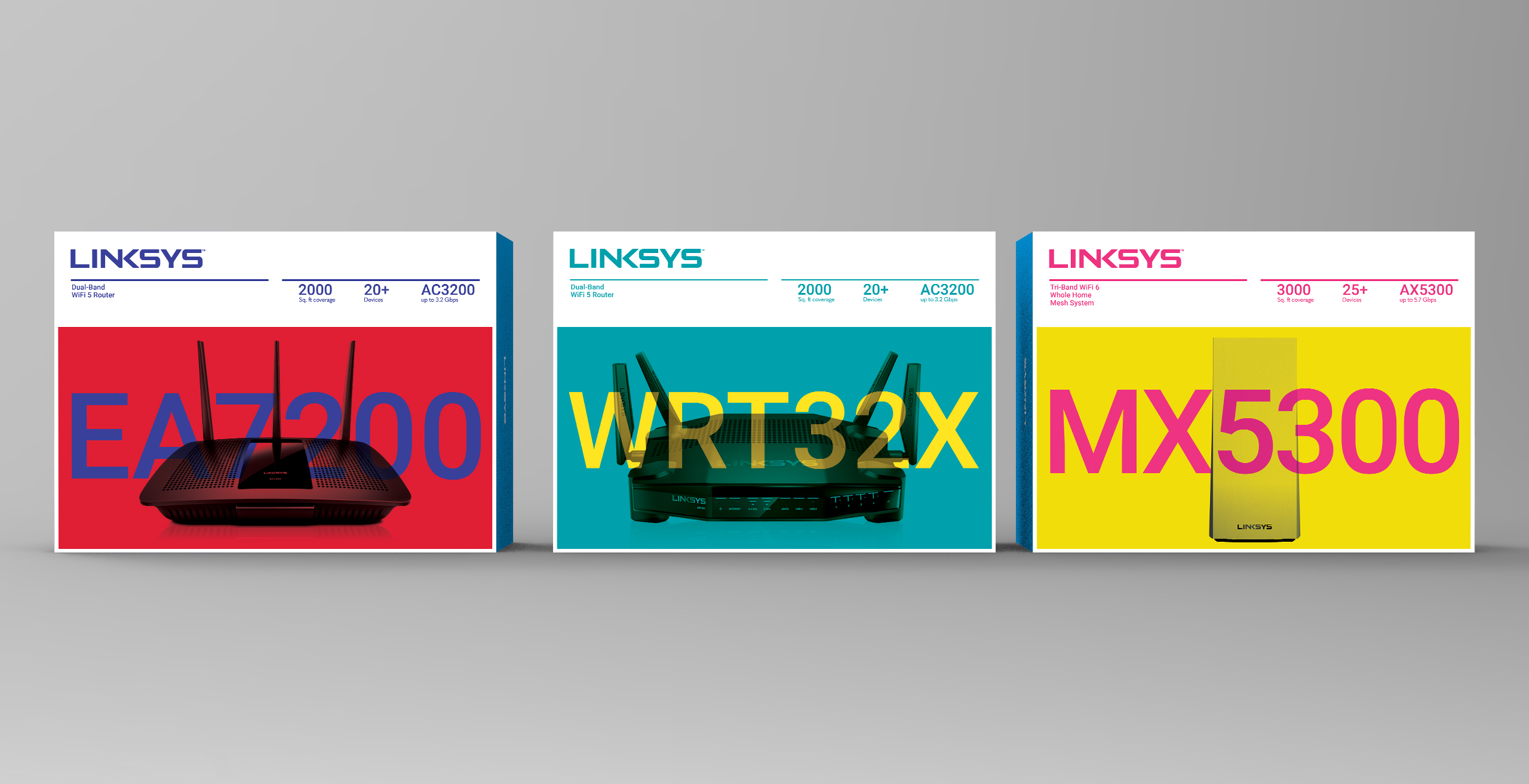
Linksys sought to address issues with their product packaging, which failed to effectively convey the capabilities of their internet routers to the average consumer. The challenge included simplifying technical specifications and making the unattractive router design visually appealing. Recommendations involved improving product photography and emphasizing the packaging as a crucial opportunity to evoke desire. The design process incorporated the brand's "K" to reinforce Linksys and visually linked the boxes to enhance brand integration.
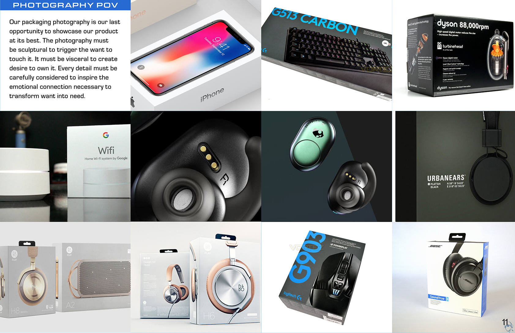
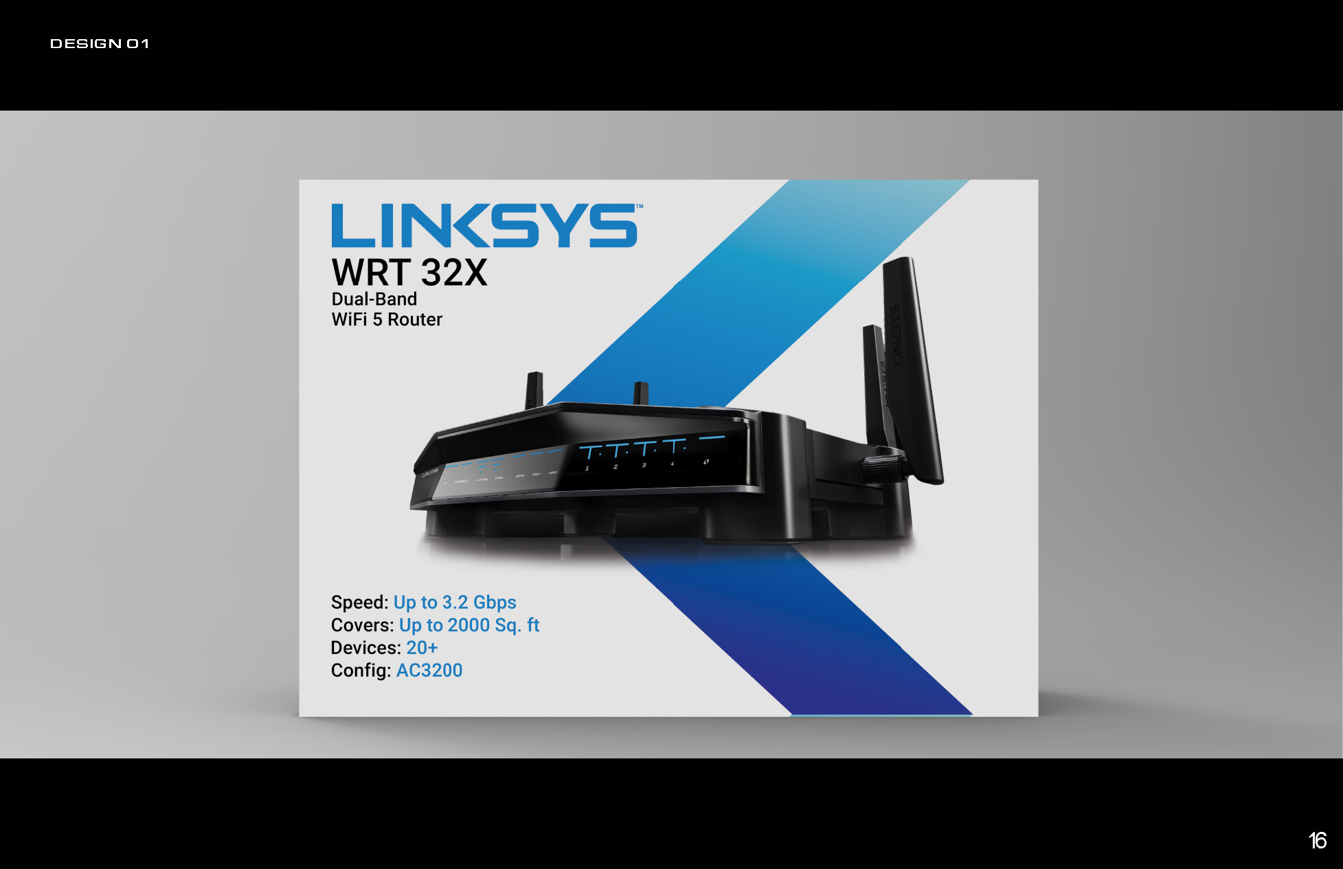
One more problem: the routers themselves are ugly, spiderlike devices that most buyers wouldn't intend to showcase in their living room. Our challenge was to display the product shots on their packaging as sexy as can be. We gave recommendation for better product photography as well as rationale explaning why.
"Our packaging photography is our last opportunity to showcase our product at its best. The photography must be sculptural to trigger the want to touch it. It must be visceral to create desire to own it. Every detail must be carefully considered to inspire the emotional connection necessary to transform want into need."
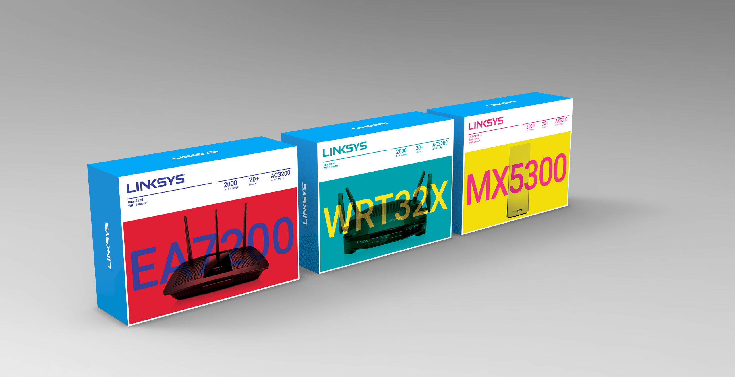
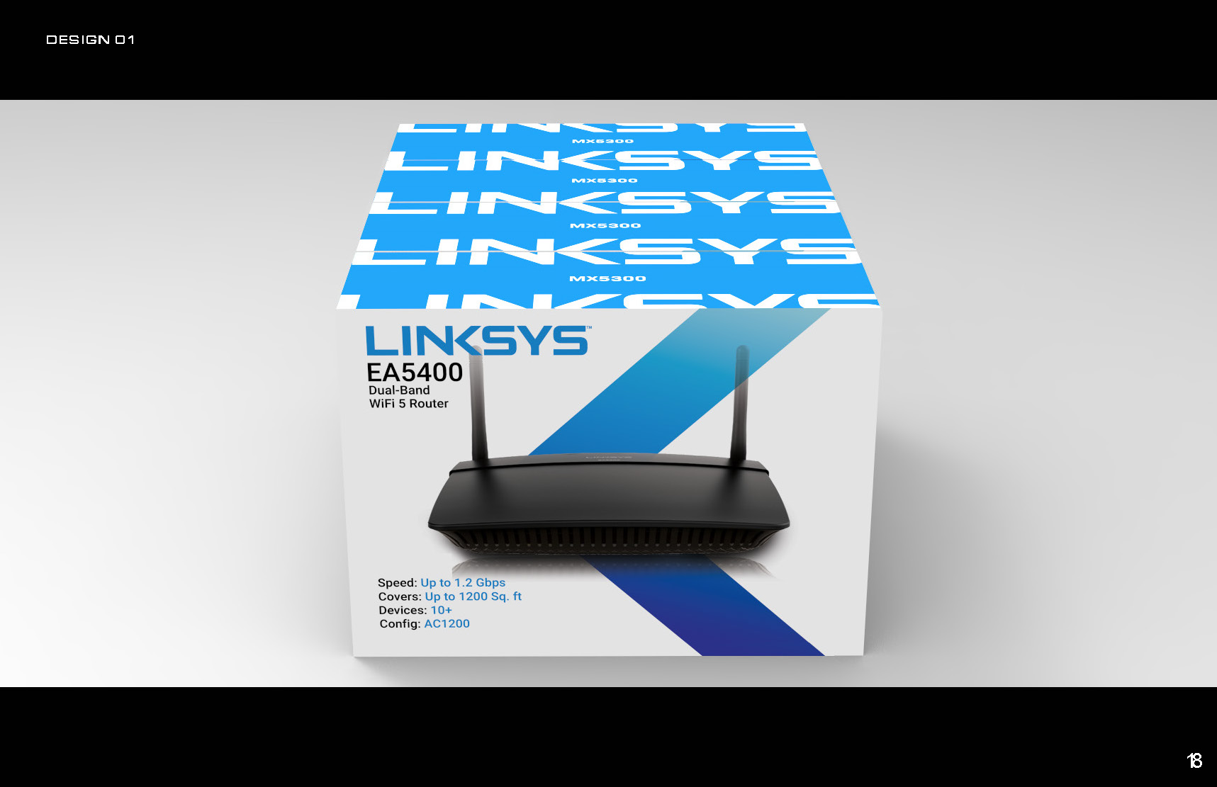
With that cleared up, we began designing. This first design showcases an opportunity we saw to use the "K" in Linksys to reinforce the brand in its packaging. Also, you'll see in the last picture we "linked" the top of the boxes to even further use the brand in our design direction.

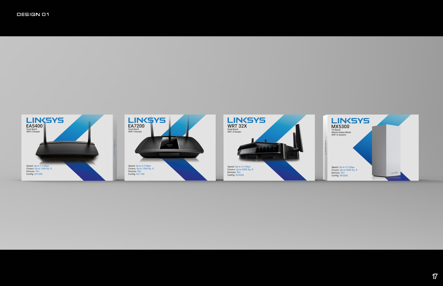
Below are some alternative design directions that we thought would catch the consumers eye when walking through the halls of Best Buy, or wherever.