
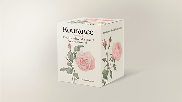
Kourance
Packaging & Identity — Market Entry Strategy
Client: Nihonchokuhan (Japan)
Role: Brand Identity, Packaging Design, Motion
Type: CPG — Health & Beauty
Agency: Arcana Academy
The challenge was to transition a Japanese health essence into the competitive US beauty market. I moved away from the cluttered original packaging to a strategy of "Modern Japanese Zen." By pairing a tranquil, minimalist logotype with delicate watercolor roses and traditional Kanji, the brand establishes a premium, holistic persona that emphasizes peace and quality.

Section 01:
Logo Design Process
An exploration into "Modern Zen." While initial directions leaned into a more utilitarian modernism, the final selection—a flowing, elegant serif—was chosen to mirror the organic movement of rose oil and the product's premium positioning.
Section 02:
Packaging Design Process


Section 03:
Trade Show Motion
For the US launch at a Las Vegas trade show, I translated static concept stills into a 50-second brand loop. Using Runway, I architected the fluid, surreal transitions—from roses dissolving in water to weightless, dreamlike environments. This workflow bridged the gap between raw AI ideation and a high-fidelity physical activation.


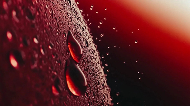
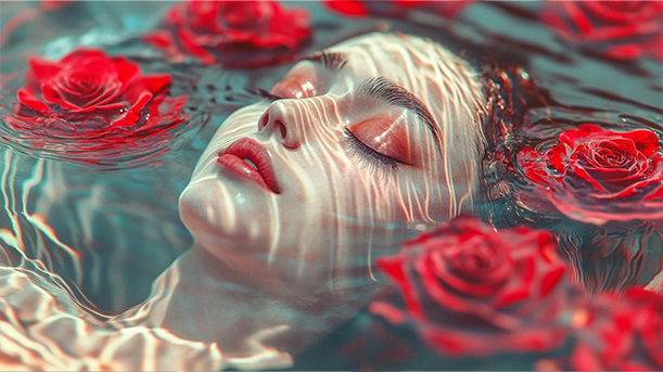


Phase 01: AI-generated conceptual storyboards establishing the ethereal visual narrative.
Phase 02: Final Production. Translating static concept territory into a 50-second motion piece using Runway for fluid, ethereal transitions.
OTHER CASE STUDIES & SELECTED WORK